Dedicated to simple decor ideas - especially in white! - inspiration for living simply,
reusing what you have, and scouring for vintage or thrifted finds. Some of my own DIY projects described here too.


Showing posts with label white decor. Show all posts

Thursday, December 31, 2009

Your Inner Stylist: Pushing One's Creativity

Can you create a stunning vignette? While I had just been over on decor8 the other day, I noticed Holly has set up a challenge on one of her new flickr groups, Interior Styling. She urges budding and experienced stylists to create their own vignettes, in their own home, using one's own things. OK. I'm up for that! I've been lax around here since the summer, only gaining energy while my hubby has time off, and with that, my creativity comes back (phew! mothering two busy little people under 7 years old wears me thin!). So thanks, Holly! I feel inspired and ready to undertake some new work in the New Year!
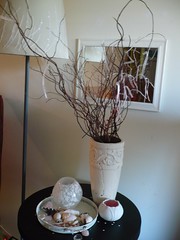
This was my contribution, made many months ago, to the Interior Styling group:


This was so long ago, that I have since restyled the table all together, blogged about here. Now I must don that creative cap!

Wednesday, July 15, 2009

My tiny, but now color cohesive, finished patio

Here is my latest finished project: my patio, just a little slice of outside for us and the kids - as evidenced by the sandbox in the right hand corner (really quite a life saver for me as it can occupy them for a while : ) ).

While I was trying to make the chandelier work, or place it on Craigslist, as it only fits outside, I also wanted to create colour cohesion throughout my small space, following the interior to allow the eye to travel outdoors. To achieve this, paint was needed! Items that were black had to lighten, so I painted the Ikea Noresund table grey. I used Tremclad grey primer. My thought was if grey wasn't it, then I could go with white on top. But, it turns out, I like the dull grey.

My inspiration for a grey table came from one of Judith Wilson's fantastic books, The Natural Home:

Particularly this metal table from Wilson's book:

Et voila, here is my table, along with breakfast and coffee. The dish is Ikea, and the cup is from my new favourite line of Sophie Conran Portmerion pottery. I love the texture the pottery. It feels like its just thrown off the wheel.


The plant stand after 15 years is beginning to rust and needed a face lift. Here it is before. But I did not use metal paint - especailly spray paint - that was an unenjoyable toxic experience. So, I just mixed some blue and white latex for a chipped, beachy feel. I won't mind if it chips some more. Who knows, maybe next summer I'll paint it another colour? At any rate, I think I've achieved some colour flow, and that crazy chandelier works a bit better than before.

Thursday, July 2, 2009

Painted chanedlier


Ever since I saw the cover, and blogged about Josephine Ryan's French Home, I've been lusting after this chandelier, which I found at a local shop. Its rather interesting to me now, how some things can look so fabulous in a book, snapped by a photographer, and in France, of course, compared to one's 'standard apartment.'

Its quite large! So large, my hubby was walking into it while it hung in our living room apartment. (Sadly, he also started calling it a bee hive.) It really needs a high ceiling, or a light filled kitchen over a table so that it need not need to be turned on! Just like its pictured in the book. So I hum and haw if it will work on the patio, and if it should be placed on craigslist. Then I wonder if all would be better at least with candles, and perhaps a few crystals, like in the book, of course! What do you think?

Tuesday, May 12, 2009

Feature Apartment


Here is another lovely apartment featured as this month's apartment on Livingetc. Certainly this apartment has beautiful structure on its own, however, Hannah has kept her decor simple and the lines throughout very clean. She has mixed modern and vintage, white with bold color and print inspiration, with an especially girly touch in the bedroom. The mirrors add a light and airy touch. Although the kitchen is tiny, its streamlined to cook and very cute. I like the reflective tile backsplash. It echos the lightness of the mirrors.

Monday, May 11, 2009

Shabby Chic Home - book review


I have to attribute much of my style inspiration from Rachel Ashwell's Shabby Chic Home. What started out as home renovations for Ashwell turned to a chronicle of the transformation of her beach home. The before and after pictures are truly inspiring. An experienced treasure hunter, Ashwell breathes new life into home accents, such as chandeliers and furniture with 'good bones' (structure), demonstrating just what a coat of white paint can accomplish. Ultimately, Ashwell's shabby chic style embodies simplicity and embraces the 'less is more' philosophy.

European from the start, Ashwell's style is of a French villa or English countryside. In describing her style, she writes "My philosophy of decor is that nothing should be too precious. A child should feel free to put her feet on the sofa, a guest, his cup on the coffee table. I believe in cozy, not fussy; relaxed, not stiff. I believe in living in, on, and around one's things, not merely with them.
A roomy, slipcovered chair big enough for a child and a dog or two, with slightly wrinkled, worn fabric and ample arms perfect for plopping your legs over; an old trunk, its paint peeling around the edges, given new life as a coffee table; a vase of roses from the garden, a bit wilted, a few petals missing; a vintage mirror, framed with a white floral iron piece salvaged from an old gate and chipped in places, but still charming; a slightly rusted flea market chandelier; a scratched-up coal scuttle used as a bread box; an array of vanilla-scented candles adding a warm glow to a cozy room--these are some of the elements of the effortless, inviting look I prefer. Colors in keeping with this way of living tend to be soft, palatable tones such as seafoam, mint, and celadon greens; dusty roses; pale sky blues; and ivories, creams, and grays that appear to be muted by age, or crisp, clean whites that blend with everything. Brighter or darker colors can occasionally be a part of the look if they are treated with subtlety, combined with white or light colors, or if they appear to be faded by time."

And so, an effortless description of how to capture such a style - or add a dash of shabbiness to our homes - making repurposing furniture even more inviting than ever before.

If you're looking for some easily found shabby chic treasures, be sure to visit Elizabeth's Centre Stage shop - address and photos to the right.

Images courtesy of the Shabby Chic Official site.
Sunday, April 26, 2009

At Home with White, Atlanta Bartlett

Everyone's talking about At Home with White by Atlanta Bartlett, touting this book as one of the best in home decor on the subject of white. It really proves that timeless white is a perfect canvas for a home. While the pictures are stunning, there is some real life practical advice on how to use white - notably how to make a white decor scheme work by understanding white color families. Here Bartlett breaks white into 6 main color families:

chalky - romantic, ice cream, pastel shades

muted - 'work well in older homes and complement antiques beautifully'

neutrals - 'buff, taupe, beige, with undertones of yellow, brown or grey, work in elegant interiors'

creamy - 'warm and soft off white tones that would work in a country setting'

cool - 'crisp, clean and modern, has bluish undertones' (think Ikea)

grey - 'work well in cold daylight, and are therefore popular in Scandinavian countries, and are a mix of black, red and green pigments'

Your light source, or piece of inspiration furniture or accessory, can help you choose which white family to adopt. Here are some inspiring pictures from her book: